


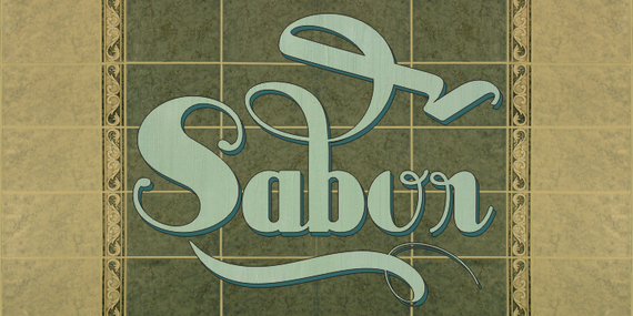
Sabor is a voluptuous upright connected display font with mixed taste of script fonts. There was many inspirations for Sabor, but all starts with a book from 1950's about the battles of II War. To that first sketches of a naive dense display typeface we, day by day, start to create a mixed style envolving some lettering concepts from 1950"s, some calligraphy notions and the first display ideas. The feeling of this font is good to be used in many artworks, like logos, packaging, party invitations, layouts for t-shirts, magazine headings, and much more, since websites to and all kind of printed jobs.
That font is not really a script, but, like the scripts we strongly recommends to use the caps only in the begining of words and sentences, to contrast with the lower cases : it’s not designed for all-caps settings, so avoid that kind of use.
This font has almost 700 glyphs and supports the most important Latin-based languages. We works hard in a tour-de-force kerning: over 12.000 kerning pairs soft adjusted handly. Its OpenType features include final forms, initial forms, special sets (upper and lowercases), hundreds of contextual alternates ligatures providing letterform variations and concetions that make your designs really special, and ornaments (tails).
Because of its high number of alternate letters and combinations, we suggest the use of the glyph palette to find ideal solutions to specific designs. You have full access to this amazing stuff using InDesign, Illustrator, QuarkXpress and similar software. However, we still recommend exploring what this font has to offer using the glyphs palette: principally to get all the power of the Contextual Alternates feature.